The
week before we began the next long pose, it was decided that all the students
of Bandiera Studio were to spend the week painting! This was a pleasant
surprise; usually students work their way up to paint only after finishing the
drawing program. I have painted on my own in the past, but haven’t had time
to pick up my palette since I started my studies here. It was wonderful to
be able to use my brushes again for these small paint-sketches, especially
after using more linear methods like pencil and charcoal.
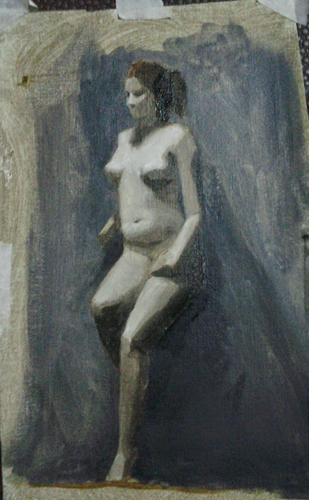
These
figure-paintings were done in grisaille; that is, using only the colors Ivory
Black, Lead White, and Raw Umber. This is how students are introduced to
painting; using only these three pigments, the student can focus solely on the
values (range of light-to-dark), and a bit on the temperatures (range of cool-to-warm),
without the complications of more specific colors. The goal of the exercise was
to capture the general light and dark shapes by organizing these values in
their correct relationships.
Here
are some examples:
Day One: not quite enough contrast between the lights and darks, and I think I could have benefited from some more variety in the halftones, but I think the temperature difference works well; I was particularly happy with the effect of the model's red hair contrasting with the cool tones of the backdrop.
Halfway through the week: here I think I started to get the hang of the value contrasts. But looking back, I think more raw umber would have helped in the skin-tones, which look a little dull here and too similar in temperature to the background.
I
think towards the end of the week things began to come together; the lights and
darks are each well-unified, bridged by a few halftones with just enough variety, and all relate to each other and the
value of the background correctly. The backdrop is mixed almost entirely with
white and black paint, to represent the cooler temperature of the background,
while the figure was painted with more Raw Umber, to depict the contrastingly
warm skin-tones.
All in all, a fun and enlightening week!
I
didn’t just enjoy myself at school; last weekend, Florence held its annual
Chocolate Festival.
Rows and rows of chocolate vendors were stationed near Santa Maria Novella, selling everything from truffles to hot chocolate to chocolate-covered strawberries.
Rows and rows of chocolate vendors were stationed near Santa Maria Novella, selling everything from truffles to hot chocolate to chocolate-covered strawberries.
 |
| Almost too pretty to eat...almost |
After sampling a bit of everything, I settled on
a perfectly lovely bar of dark chocolate with mixed berries
Hope
you all had a wonderful Valentine’s day!
Italian
word of the day: “Dipingere”,
"to paint"


